A skeleton screen is a technique of rendering placeholders for text, numbers, and other parts of a UI that haven't yet loaded. As a user interacts with the UI, they immediately see the illusion of new screen states—the skeleton—and this makes the app feel very fast. The skeleton layout is typically animated in some way to convey that data is still loading.
My team at Mozilla built addons.mozilla.org with skeleton screens for all loading states. This article covers some of the details about the techniques and approaches we took and some gotchas. It focuses more on the concepts rather than the implementation but CSS Tricks has a nice article about doing it entirely in CSS. Fancy!
First, Let's Talk About Spinners
Showing an animated spinner is another way to convey a loading state. The app would show a spinning thing then transition to the full layout when data has loaded. It's a bit abrupt. The transition from a skeleton screen to a fully loaded screen is a lot smoother because the skeleton layout looks closer to the final screen.
When building a complex UI out of shared components with spinners, you might even end up showing many spinners on a page while loading data. If you want to see some spinner madness, watch Andrew Clark present an example at ReactConf 2018. Seeing so many spinners is visually jarring and doesn't really help the user understand that the data they requested is still loading; it's just confusing.
Andrew presented the spinner problem to introduce concurrent mode and the suspense API, which can both be used to replace many spinners with one spinner by declaring a fallback component. That's a great solution but skeleton screens never even had this problem to begin with! In fact, skeleton screens fit very well with React's concept of component isolation. Each component can be in charge of rendering a skeleton of its own final UI.
Simulating Text
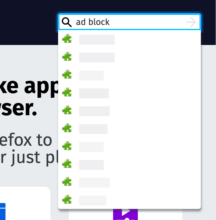
Here is an example of a skeleton screen we show on addons.mozilla.org when a user is typing in the search box.
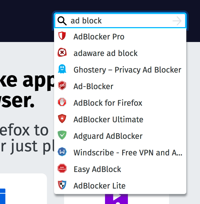
When the autocompletion results load, it looks like this:
Here's the actual loading process, slowed down so you can see the transition more clearly:
Screencast
In this case, the skeleton is a rough silhouette of text with generic icons representing real icons. The placeholders use randomness to simulate sentences of varying length and this is a key aspect to simulating text. Without this, the skeleton will look like racing stripes, not text.
You'll also notice from the screencast that our skeleton screen pulses in non-uniform ways to indicate progress. This is a matter of taste but I think the non-uniformity works well for text.
The placeholder isn't an exact simulation of text and this is important. If the loader simply blurred some real text then that might encourage the user to try and read it which could strain their eyes.
Simulating The Final Screen
It's really important that the skeleton matches the final screen down to pixels. For text placeholders, matching the height and line-height of the final text is crucial. This is one of the most common mistakes I see made by skeleton screens on the web. If you don't get this right, the transition from skeleton to fully loaded is jarring and distracting. In the autocompletion example above, we could have tightened it up but it's pretty close.
We had a bug on addons.mozilla.org where the skeleton screen looked broken at a very specific window size. Here it is:
It looked obviously broken and didn't match the loaded screen very well:
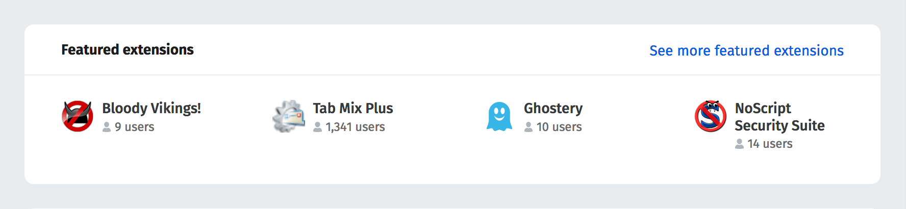
The culprit was the placeholder for the count of add-on users (e.g. 1,341 users); it was allowed to grow too wide. The fix was to retain randomness but constrain it to a realistic width.
This is a hard problem to get right but it will make the loading transition so much smoother. The problem gets harder when there is a lot of dynamic text. You can't simulate every possibility, especially in how text variations can extend the height of an element.
Also, developing a pixel perfect skeleton screen takes time (as with anything) and sometimes you just have to ship code. There are many screens on addons.mozilla.org that our small team hasn't had time to polish up yet.
Simulating Dynamic Lists
When you're rendering placeholders for a list of items, how many skeleton items should you render? In the autocompletion example above, it was easy because the result set was limited to 10 and all 10 slots would be filled in a typical search.
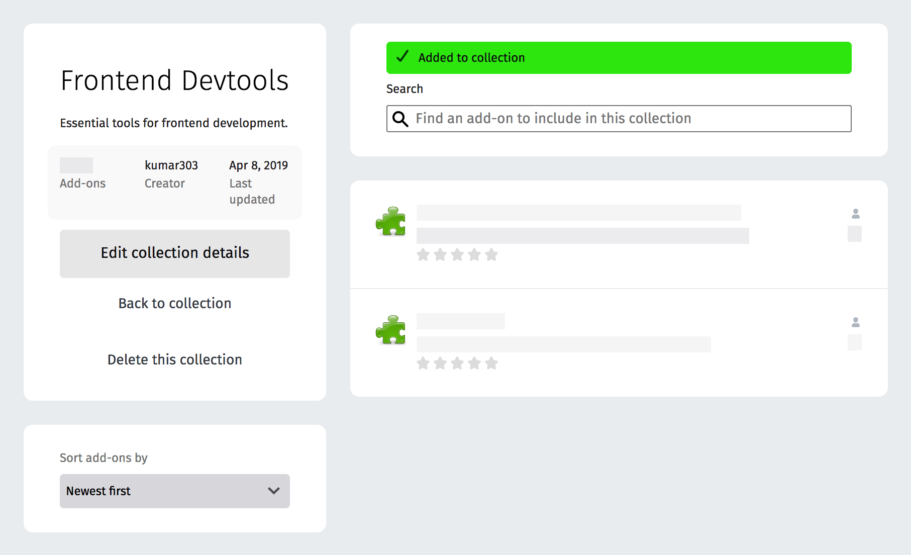
Here's an example of the add-on collection editor for addons.mozilla.org which was a bit trickier. This is what it looks like when the API response for adding an item is still pending:
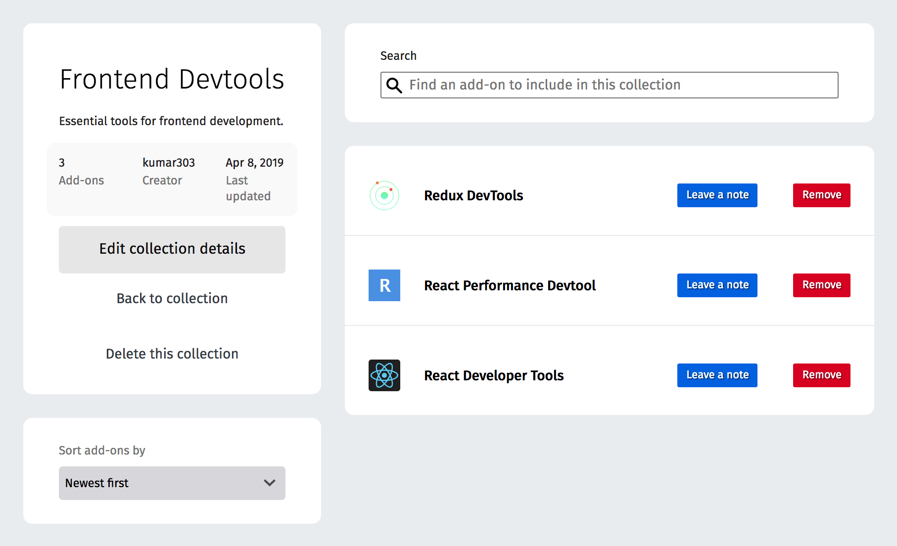
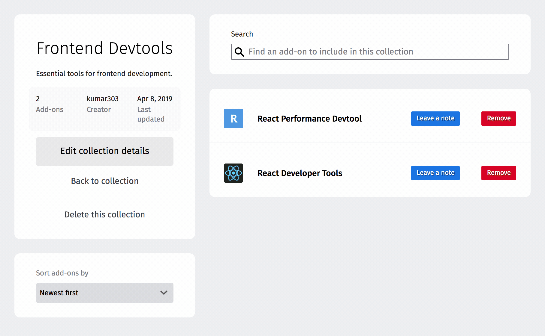
Here it is when the API response is received:
See it in action on a throttled nework connection:
Screencast
Early on in development, the skeleton always showed a fixed number of placeholders (10, I think) but that looked jumpy when a collection only had one or two items.
In the final version (above), the skeleton shows placeholders for exactly the last number of items in the list. This technique takes a bit of effort because you have to track the last number of items somewhere but it's simple and effective. It makes the loading transition a lot smoother.
A skeleton screen is ultimately a prediction of the final screen but with placeholders. We could have made the skeleton screen try to guess the final number of items before receiving an API response. Adding extra complexity like that wasn't worth it but maybe in some cases it would be. Optimistically predicting a UI state is another fun problem that maybe I will write about.
By the way, I almost didn't include the screenshots above because we totally took a shortcut and re-used a skeleton of a different state: the read-only view with rating stars, etc. D'oh. We have a small team and we ship fast! It would be nice to tighten up the skeleton here.
Skeleton-thinking
When working with skeletons, they will become a part of your day to day UI development. Let's compare and contrast this kind of development by first looking at how you might work with a loading spinner, using React as an example:
export default function UserProfile(props) {
  const { user } = props;

  if (!user) {
    return <LoadingSpinner />;
  }

  return (
    <div>
      <image src={user.profileImageSrc} />
      <h2>{user.displayName}</h2>
      <p>{user.bio}</p>
    </div>
  );
}
I'll admit, that is concise and simple. Do we have the user data? No? Render a spinner. Otherwise, render the user profile. It becomes a little more complex when you want to support skeletons:
export default function UserProfile(props) {
  const { user } = props;

  return (
    <div>
      {user ? (
        <image src={user.profileImageSrc} />
      ) : (
        <image src={GENERIC_PROFILE_IMAGE_SRC} />
      )}
      <h2>{user ? user.displayName : <SkeletonText />}</h2>
      <p>{user ? user.bio : <SkeletonText />}</p>
    </div>
  );
}
The component will need to toggle between a skeleton and loaded data for each part of the screen. It helps to use a visual testing tool to flip through the skeleton state and all other UI states while developing. I rely on Story Book for this.
An interesting thing happens when you start working with skeleton placeholders. You realize that you don't need to render a lot of placeholders. In the example above, imagine that you had header text, form labels, and other things. These won't need placeholders. Any element that you can render immediately will help make the application feel fast and snappy. The UI still needs a visual indication of progress, though.
Once skeleton thinking becomes part of your day to day development, it becomes easy. The extra effort results in a much smoother experience. A lot of sites use skeletons these days and I always like the feel when they're done right.